
Choosing a monitor for photo editing is not easy, but it is an absolutely essential step to ensure the best quality output of your images. Read on to find out what are the most important features in a monitor to me, as well as a detailed review of the BenQ SW2700PT screen.

When one ventures into the world of photography, you just think that a good camera and lens is all that is needed to create great images. Then you start learning about all the steps it takes to reliably create solid images, and then all of a sudden there´s so much more gear you need to think about.
With 36 years of age, I´m not that old, but I still come from a time when there were no LCD screens, monitors were white on the outside, heavy, bulky, and “Trinitron” or “100hz” technology was all the rage. Then those intriguing slim monitors slowly invaded desks around the world, and with them different types of panels no one seemed to care about, except, as usual, designers/photographers and gamers. Now photographers had to worry about new acronyms – TN, VA,IPS and other panels – and this information was not that easy to find.
Fortunately things evolved and changed a lot, and nowadays monitors are clearly segmented for different types of use, with some brands offering monitors specifically created for photographer´s needs.
And what does a photographer need in a monitor? These are the most important features, in my opinion:
- Panel type – in a very resumed way, choosing the right panel (or one of its variations) is extremely important. IPS panels are usually chosen for good color reproduction and great viewing angles, chosen by creatives. TN panels offer poorer color reproduction but much less lag,being ideal for gamers and budget screens. VA panels stand in the middle between the IPS and TN, offering a compromise between color reproduction and lag.
- Good color reproduction and brightness when viewed at different angles – I´ve used TN panel laptops in the past where just a slight change in the position of your eyes, in relation to the monitor, would create hue and brightness changes, making editing quite difficult
- Full reproduction of the needed color space, which means at least 100% sRGB or 100% AdobeRGB – editing on a monitor that does not show you the full range of the color space you are working with turns editing into a hit-or-miss affair, and that is the last thing you want while processing those images that were so incredibly hard to get

- Size – some people prefer two-screen setups, others love huge screens, and only one thing is for sure: you need quite a bit of screen real estate if you want to have space for the software toolbars, and still be able to view your image with good detail
- Pixel per inch ratio – the number of pixels per inch on a screen depends on the number of pixels (resolution) and the physical size of the screen. This one is quite controversial, as most creatives are going the high-ppi road, while I still favor lower ppi screens around a sweet spot of 100-120ppi. Very high ppi screens, usually found in 4K and 5K monitors, do definitely show you awesome images, and every image tends to look awesome such screens. This is certainly great when you view your images on your own screen, but there´s always the possibility that what you are seeing will not properly translate to viewing environments with less pixels-per-inch (nowadays the vast majority of screens). Resizing for the web is also not easy in very high ppi screens, as a 1080pixel image for Instagram or a 1280x-1920x image for other websites will look very small on such screens, making it difficult to properly apply sharpening. Even while adjusting high megapixel images, it´s very difficult to discern individual pixels, so many flaws of an image may go unnoticed, until they are viewed on a lower resolution screen. When I discuss this subject with fellow photographers, I usually mention how things works in a audio recording studio, where audio producers always have their pair of favourite reference monitor speakers, usually know for their extremely flat response curve, in an attempt to expose all the flaws of a record, so that the producer can deal with them and ensure that the audio recording will properly translate both to high end audio environments and things like tiny smartphone speakers. Like I said, this is a controversial issue, as one day the majority of screens worldwide will have very high ppis, but meanwhile I prefer lower ppis, as I feel they give me a higher level of control in terms of quality output and good translation to other screens.

- Good panel uniformity in terms of brightness and color reproduction – this is not often talked about, but it doesn´t make sense to edit on a screen with a small square in the center which is properly calibrated, but then the rest of the screens shows great deviations in terms of brightness or color reproduction
- Hardware LUT calibration possibility – every monitor can be calibrated with a proper calibration device, like the X-Rite i1 Display Pro or the Datacolor Spyder. The color management settings are usually managed by the calibration device software, so if you connect the monitor to a different computer/laptop, you will need to calibrate it again, so that changes are implemented at the operating system level of the new computer. Some more advanced monitors have the possibility of writing the color calibration settings directly to the monitor hardware LUT (look-up table), so the calibration will be directly implemented at the monitor itself. This not only allows for more precise calibration, but also helps to avoid any kind of color management conflicts at the software level and, no matter what the monitor is connected too, it will keep it´s calibration.
- Pulse Width Modulation – some LED monitors employ a dimming technique called PWM, which can sometimes generate flicker which causes eye strain to some users. Unfortunately I have been a victim of eye strain due to a laptop LCD with low frequency PWM, so now I always try to use monitors which have no PWM, as I find them to be much easier on my eyes.
- Matte-Non glossy monitor – I don´t like editing with glossy monitors as I´m easily distracted with intense reflections
And so, after this quite extensive introduction, we shall move on to the monitor review of the BenQ SW2700PT monitor. My good old Apple Cinema 30, with around 9 years of use, was already showing its age through random disconnects, loss of brightness uniformity and white point shift, so this was the perfect timing to get an invitation from BenQ to test one of their monitors. I could choose any monitor I wanted and, even though I was tempted by their new SW271 4K monitor, I decided I would stay with the same QHD resolution of my Apple and requested the SW2700PT. I had been closely following BenQ, as they have a solid reputation of offering some of the best price/quality ratio monitors in the market for photographers and other creatives, so their monitors would have been a natural candidate for purchase, alongside brands like Dell or Eizo (these two classically more expensive).

BenQ SW2700PT – Taken from the official BenQ website, with my “The Doubt” photo added
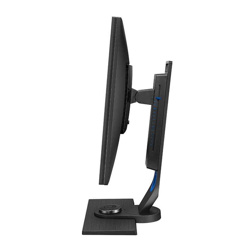
BenQ SW2700PT adjustable stand offering great ergonomics
The SW2700PT has been around for a while, and is a favorite of many creatives. I did a thorough research of BenQ´s lineup, and this monitor seemed to ticked all the right boxes, so I was extremely excited to test it and start editing my images with it.
Just like all of my reviews, I only write them after doing extensive use of the product, as flaws will only be noticed after a long period. Considering this, I have already used the SW2700PT for dozens of hours, and edited all my latest photos with it.

In the next images you can see the monitor unpackaging, as well as all the accessories that come with it. Packaging was top notch, and BenQ provides everything the end user might need to start using the monitor, not having to purchase accessory cables.

BenQ SW2700PT packaging

BenQ SW2700PT unboxing

BenQ SW2700PT unboxing
The BenQ SW2700PT was launched at the end of 2015 and has been a best seller for the brand. Remembering my introduction about which features I look for in a monitor, you can see that the SW2700PT offers:
- IPS Panel with not only 100% sRGB color space reproduction, but also full 100% coverage of the AdobeRGB Spectrum
- Good viewing angles
- Good Pixel-per-inch ratio, namely 108.9 ppi, allowing for good control of detail and sharpening both in web sized and full resolution images
- 27 inches real estate size, which is, in my opinion, the sweet spot both for single or dual monitor setups
- Hardware calibration through their proprietary software Palette Master Elements
- Apparently no PWM for dimming the monitor
- Matte screen
Besides ticking all the boxes for what I look for in a monitor, the BenQ still offers some additional features:
- Monitor hood – I had never used one before, but now I understand its importance, as it effectively blocks most light input top and lateral external light sources that could influence color temperature. Quite interestingly, it also creates some sort of psychological effect where you feel fully immersed in the editing process, as there are no distracting elements right by the monitor borders.
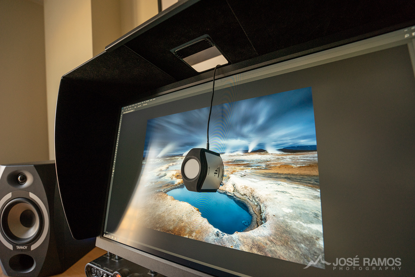
BenQ SW2700PT calibrated with the X-Rite i1Display Pro
- Professional Factory Calibration out of the box – for those who do not have a hardware calibrator, the BenQ comes with certified calibration from factory, including a signed certificate showing that. Even though it´s important to calibrate every now and then, as no monitor can keep it´s calibration stable for months, this was a nice feature to have when you haven´t bought your calibrator yet.
- Hotkey Puck – placed in the monitor base, it allows for quick change of monitor settings and changing between different color spaces. Unlike many professionals, I usually edit my images in sRGB color space, as the web and most printing facilities work with this color space. Still, there are times when I want to edit in AdobeRGB, and this monitor makes it extremely easy to change between color spaces, without having to fiddle with unstable softwares.
- 10 bit panel and 14-bit LUT, ensuring smooth transitions in low detail areas like skies, where banding is usually present with lower quality monitors.
- Ergonomics – after using the Apple Cinema 30 with it´s absolute lack of height adjustments (which actually forced me to buy a different chair with more height), I can´t explain how great it is to have a fully customizable monitor in terms of height, rotation and tilt. These monitor are big and can cause strain on your neck if position isn´t adjusted properly, so the smooth ergonomic adjustments the BenQ comes with create a more comfortable and productive environment for editing.

I´m currently using an X-Rite i1Display Pro calibrator. I think it´s better than Datacolor´s Spyder, and it´s compatible with the proprietary Palette Master Elements from BenQ. I decided to use the Palette Master Elements software to calibrate the monitor because it is the only way to create an load a profile directly into the 14 bit LUT. Besides that, like I explained at the beginning of this article, it has the added advantage of having the calibration profile directly implemented into the monitor hardware.

BenQ SW2700PT calibrated with the X-Rite i1Display Pro
As you can see, after calibrating with the BenQ Palette Master software, color uniformity is very good across the whole color spectrum, with Delta E lower than “2” for all colors.
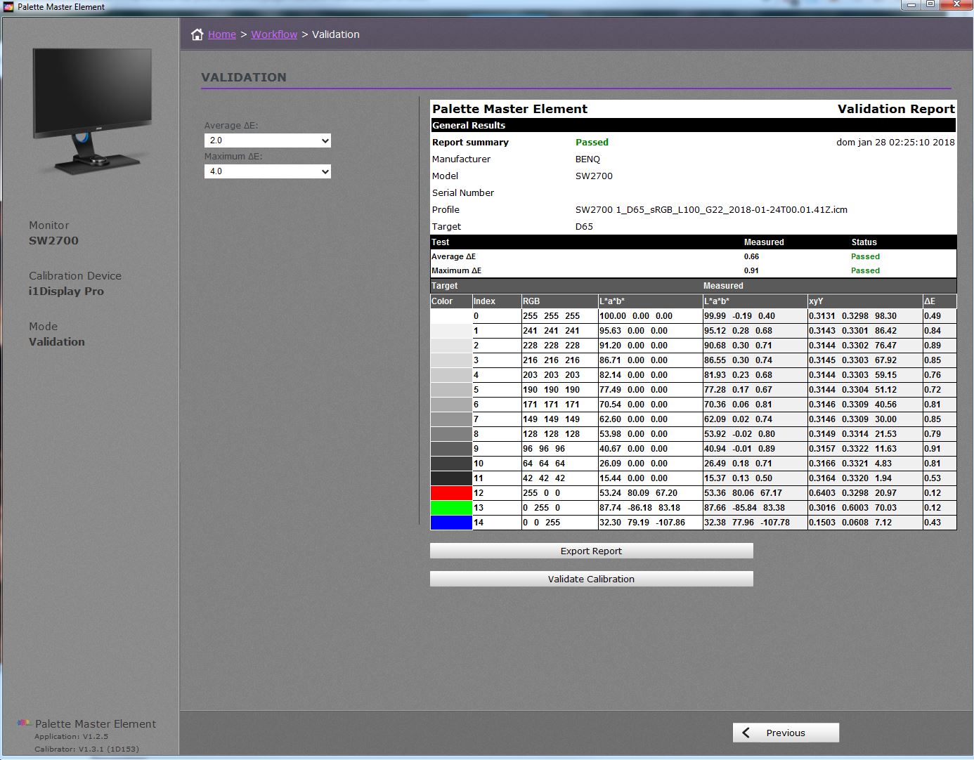
BenQ SW2700PT Calibration Validation with the palette Master Elements Software
Unfortunately it looks like BenQ monitors suffer from some color uniformity issues, which only seem to affect some units. This is something which should not happen if you are looking for a solid editing environment, so always check for uniformity (through X-Rite i1 Display Pro software, for example) when you receive your monitor. Even though much more expensive high-end monitors allow for independent adjustment of specific areas of the screen to ensure uniformity, the Benq (and many other competitor models from brands like Dell) do not have this option, so you should always make sure you have received a good unit.
Regarding my current desktop space, I´m a fan of using a dual display setup, as that allows me to put all my tools, web browser, music player and other programs in one of the screens, with the other screen being fully dedicated to image editing. Right now my desktop looks kind of strange, as I´m using my jurassic and gigantic Apple Cinema 30 as my second screen. It almost makes the Benq look small in comparison, but actually I feel much more comfortable editing with the BenQ. Right now I need to decide between going back to a single screen setup, or possibly get a second Benq SW2700PT to become friends with the first BenQ!
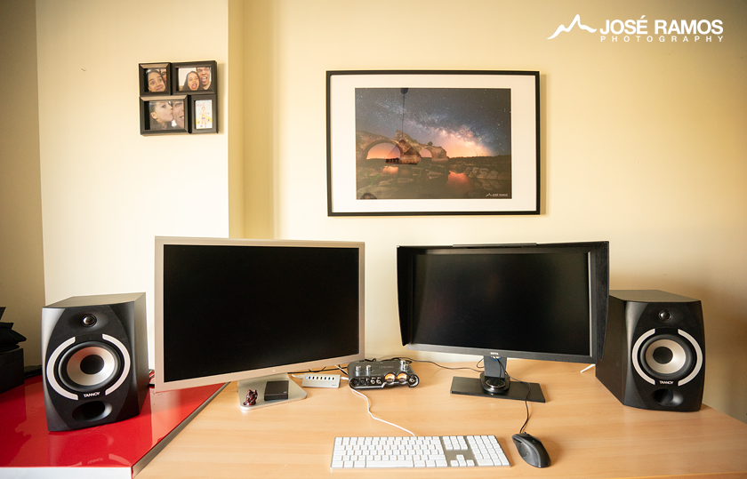
My desktop showing the BenQ SW2700PT and the Apple Cinema 30
Conclusion: assuming you can get a model with good uniformity, this is quite simply one of the monitors with the best quality/price ratio. It has been my editing companion for the last months, and it´s perfect for my needs, so I´ll keep it! Absolutely recommended!
Finally, and because the purpose of getting a good monitor is to be able to create images, here are some photos edited with the new BenQ monitor:

“Rapture” – Sigoldugljufur, Icelandic Highlands

“Equilibrium” – Lago di Braies, Dolomites, Italy

“Worship” – Dolomites, Italy

The Wonders of Awe – Godafoss Waterfall – Iceland